
Centro San Antonio
San Antonio City Branding
A rebranding effort serves as a rallying cry for citizens to declare their love and pride for their city, all while spurring economic rebirth from locals in its downtown.
For a decade, the City of San Antonio has fallen victim to its own charm.
Pros and cons of tourism.
The Riverwalk. The Alamo. It’s the perfect long weekend destination.
Unfortunately, it’s so good it’s becoming known as only that. While highly valued, growing tourist numbers (and growing tourist attractions) threatens to rip the heart of downtown away from its own citizens, and with it, the city’s longterm economic stability.
For every chain restaurant that pops up downtown, three local cuisines leave for the suburbs or out of business. More and more, it feels more like an amusement park and less like a cultural icon it truly is.
And you could see its fortunes reflected in the empty storefronts of vacant real estate.
When the locals leave the local, even a city rich with heritage like San Antonio becomes less attractive to live in. A movement was needed to reverse the community’s direction and rebuild its image as a place for its people.


But things are changing.
A robust tech community, culinary innovations and vibrant neighborhoods have emerged on the scene, empowering the city to be listed as a city on the rise, particularly among young adults.
Working with Centro San Antonio, the champion of the movement, we crafted an empowering story that was ripe to be embraced. Rooted in its diverse history with innovative plans for the future ahead, San Antonio offers the ultimate “retropolitan” experience — a vibrant, progressive urban center with a small town, community feel.
This project was always about its people. Our branding effort was simply the organizational system to let every artist, podcaster, entrepreneur, business and common citizen to contribute.
Throughout the entire branding process, we partnered with the local San Antonio community to leverage their vision for the brand, creating opportunities to bring their own voice and style to the table.
An identity born from the city's past while embracing its future.

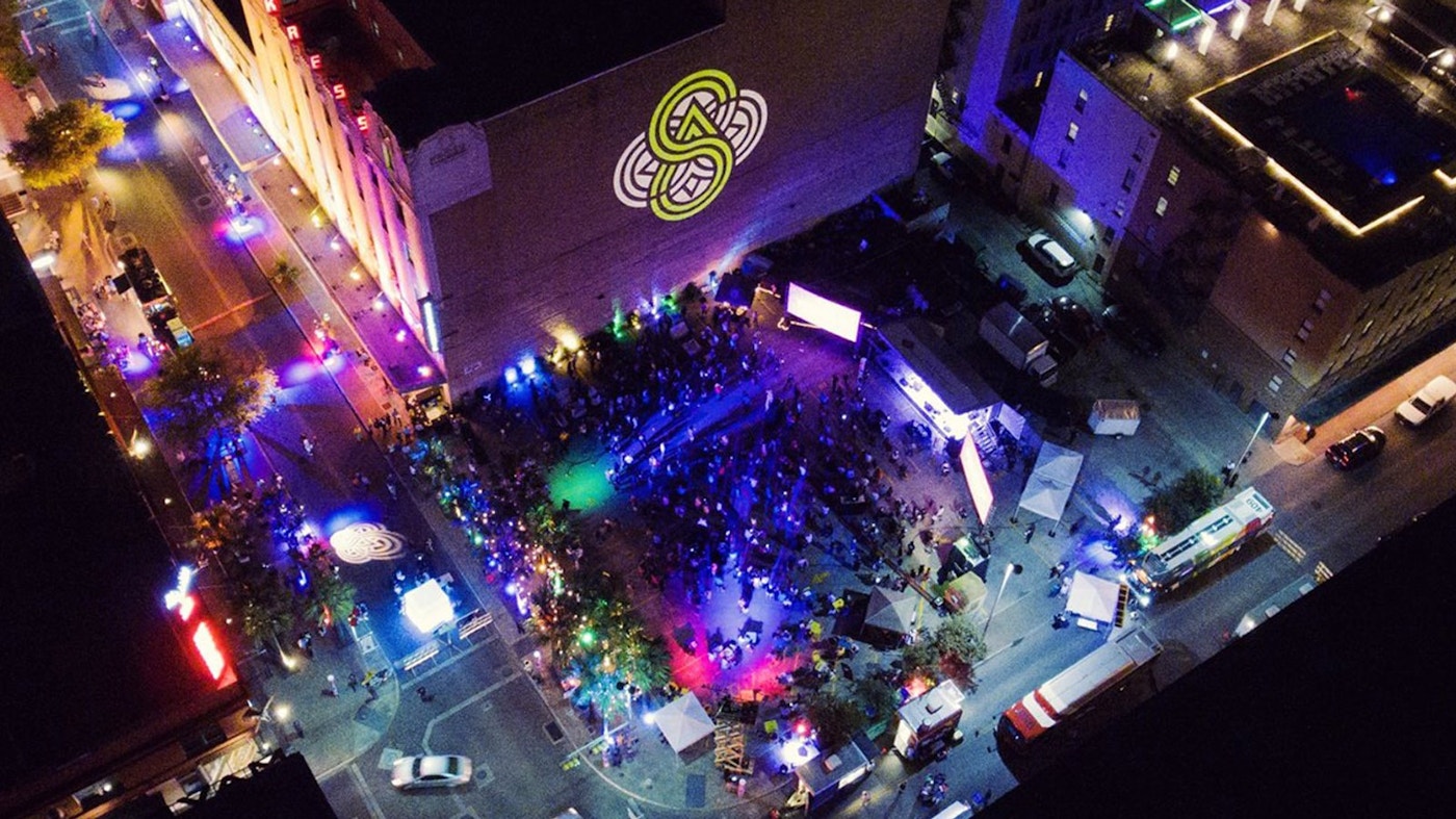
Reflecting the city’s rich cultural roots and history alongside its modern and progressive future, the new mark pays homage to the famous quatrefoil that can be found throughout the areas history and culture, while bringing with it a new sense of innovation and vision.
The mark visually represents the interconnected nature of the neighborhoods, people, cultures and lifestyles that make up the fabric of our downtown, while subtly depicting the upward progress that San Antonio has always had within its DNA.
Design note: you’ll see a nice “S” and “A” interwoven into the graphic language, as well as the river that runs through the city.


The neighborhood brands truly make the city flourish together.
To represent the diversity of neighborhoods, we created a family of micro-brands that embody the many districts that form the larger community. Relying on aesthetics, colors and tone of the city brand, each mark is uniquely identifiable within the larger brand family.
Throughout the process, we partnered with the local San Antonio community to leverage their vision for the neighborhood mark, creating opportunities to bring their own voice and style to the table.


